SNCF Stations Clustering
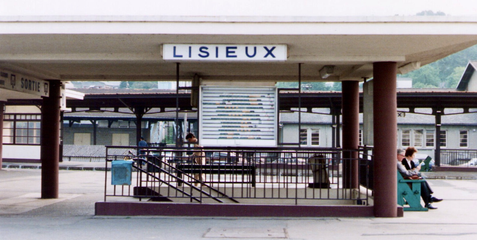
Lisieux was voted the worst station in France
In marketing we often work with surveys, and in marketing statistics and its more progressive branch, predictive analytics, we base our prediction on survey results. The survey itself - and the question if it was well-made - is not something that we commonly ask ourselves. Too bad, because this analysis can reveal interesting information. Just to illustrate how long we can play with the same dataset and still discover new and captivating results, I’m going back to SNCF satisfaction survey data discussed in this post. This SNCF survey collects and presents information about travelers’ satisfaction with several aspects of the station. Let’s see if we can learn about latent factors behind the questions’ answers.
We are going to import the survey and have a look at it:
Below are the survey questions (our manifest variables). The objective is to build latent variables that are not explicitly present in the survey but that explain what satisfaction is based on.

If we look at the correlation table, some variables are highly correlated, as expected.
One of the problems with highly correlated variables is that we had a predictive model to build (for instance, a logistic regression model that predicts if the customer is going to complain about the train station), we could not have used all the variables. Instead, we should have either dropped some of them, or have created some synthetic variables based on intial factors. These syntehtic variables might as well be the new latent variables that we are going to make.

Looking at the correlation plot we can see that the variables are evidently grouped into several factors. So, we can expect few latent variables to explain most of them.

It seems to a naked eye that there are might be three to four clusters present. We are not going to rely on intuition, and will use Artificial Intelligence to tell us how many factors are there (below is scree-plot which tells us exactly that):

According to scree-plot, there are most likely two factors. Let’s have a look at eigen-values to confirm that: 6.361, 1.011, 0.637, 0.345, 0.306, 0.213, 0.088, 0.039 and 0
Indeed, we have two defined factors. Notice that the first one is much more important than the second one.
We are going to perform Exploratory Factor Analysis (EFA), a technique within factor analysis that serves to identify the underlying relationships between measured variables.
Let us first perform EFA with orthogonal (independent) factors:

It seems, however, that the factors are in fact dependent. We will try factor analysis with oblimin rotation and Bartlett score instead:
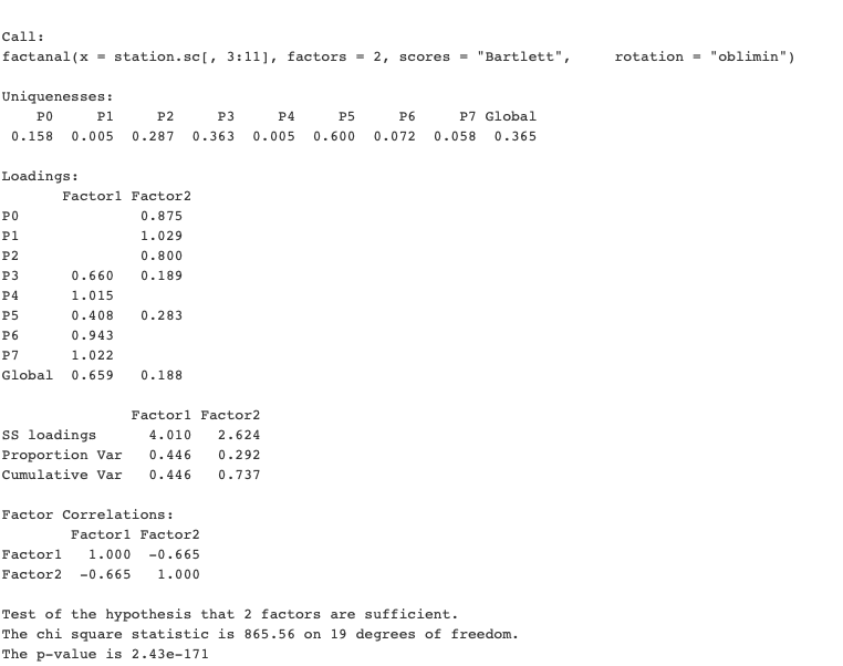
The model summary tells us that these two factors explain over 70% of variance in manifested variables.
Very low p-value tells us that two factors are (with extremely high probability) explain data sufficiently well.
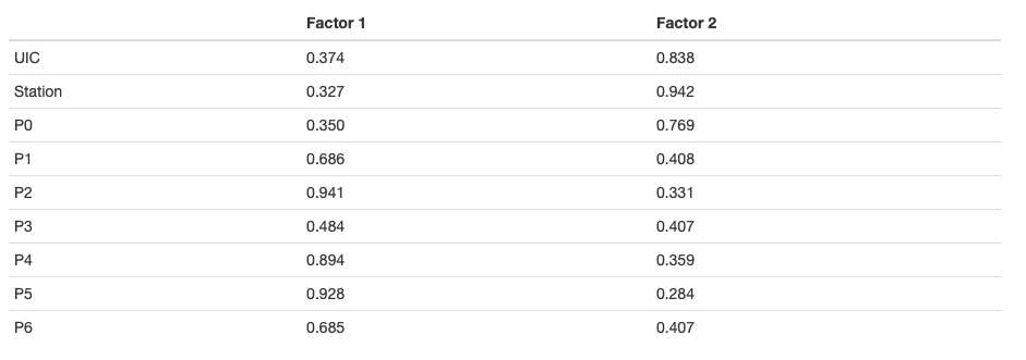
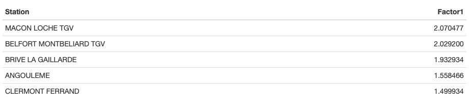
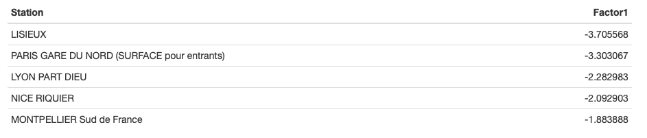
The first factor is the “ambiance” factor. It loads heavily on how well the traveler spent the time at the station and liked its environment. It also captures the satisfaction with station’s cleanliness and its shops.
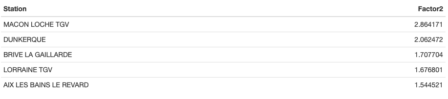
The second factor is the “movement and information” factor. It is the satisfaction based on how easily the traveler was able to find what he or she needs (his or her platform, the right exit), and get there. Satisfaction with cleanliness and shops also counts, but to a lesser degree.
The curious thing to notice is that these factors are quite strongly negatively correlated.

We can see that the heatmap of factors explains the data even better than before.
Our findings can also be presented as the path diagram, which shows latent variables (“Satisfaction with Ambiance” and “Satisfaction with Information”) and the individual items (manifest variables) that are related to them.

Now - and this is curious - what can we tell about the type of the travelers, based on these factors?
To begin with, we must know that the ratings in the dataset are synthetic ratings coming from arriving and departing travelers. An analyst might suggest that Factor 1 is mostly the basis of satisfaction for departing passengers, and Factor 2 - for arriving travelers. To be able to confirm or reject this hypothesis we would have needed to look at the separate satisfaction scores by group, and collect this data if it’s not available.
What benefits can SNCF draw from these conclusions?
For once, if in future they need to learn about customer satisfaction again, they might just focus on asking the travelers two questions: “How do you find the ambiance?” and “How easily did you find what you needed?” Of course, it will only be helpful assuming that the cost of data collection increases with the number of questions asked.
Another benefit is coming from knowing that global satisfaction is mostly based on ambiance satisfaction. If the managers had the goal to improve travelers’ satisfaction, but only had the limited budget (which is often the case), it helps to know what to focus on. Imagine, the manager has to choose between two options: investing in comfortable chairs and, let’s say, TV screens in the waiting area, or putting more screens with information, directions signs and hiring more people for the information desk. The factor analysis shows that first investment is more likely to yield better results. Before the choice is made, however, more data has to be collected to explain what are the key factors that define train station’s “comfort” and “ambiance”.
Best and worst stations
Let us now look at the list of the stations that were considered as the best and the worst with respect to these two latent factors:
Train stations with the best ambiance
Train stations where it’s easy to move and find the information
Train stations with the worst ambiance
Train stations where it’s difficult to move and find the information
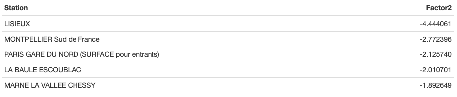
So, with individual scores available for both factors, another information for SNCF managers would be what factors to focus on depending on each station. Granted, Lisieux could benefit from both ambiance and information interventions! I’m now curious to go and see what’s THE WORST TRAIN STATION IN FRANCE looks like :-)
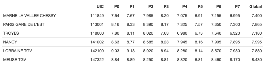
Let’s see the original unscaled data, at least, to make sure there is no mistake:
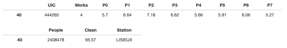
First thing that the eyes fall on is that the level of works in the train station is at 4, which is the maximum. The individual satisfaction ratings also seem low. I wonder if it scored the minimum at any of those.
To check, let’s see what are the records that have minimum satisfaction on each of these variables P0-P7:
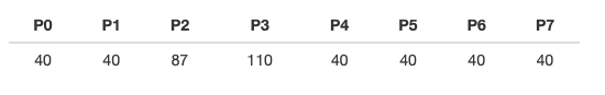
So, we see that Lisieux (record #40) scored the absolute minimum on ALL the ratings except P2 and P3.
Simple Internet search also reveals the troubling truth: there are works in the train station since 2017, and in March 2019 the new bridge was going to be installed. Since the dataset we’re looking at is also from this period, we can suppose that the works and the resulting chaos in the station affected travelers’ satisfaction.

SNCF Stations Clustering
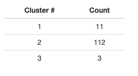
As a side project, I have trained several clustering algorithms on SNCF station data. Surprisingly, it was simple hierarchical clustering that yielded the best results. I’ve retained three clusters:

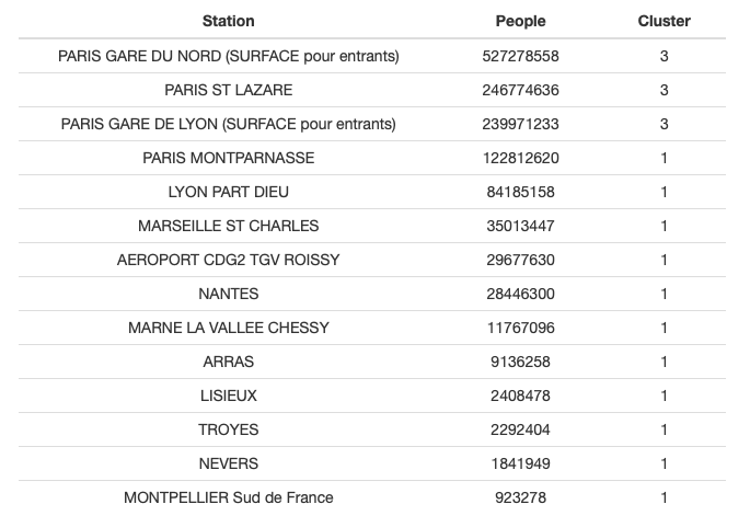
Below is the list of the stations belonging to the two smaller clusters:
It’s interesting to have a look at clusters’ means to form an idea what describes these clusters:
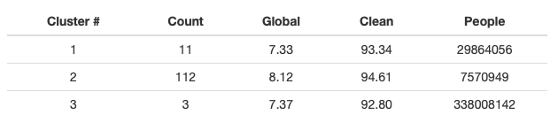
So, cluster #3 is clearly the huge stations, by far. Cluster #2 is smaller stations, but with much higher satisfaction.
In short, it’s something like this:
Cluster #2 : Nice stations
and the remaining mediocre stations are split into:
Cluster #3 : Huge stations
Cluster #1 : All-the-rest stations (moderate in satisfaction and size).
The histograms below help to understand it visually:


And the cross-plots make us marvel, one more time, at what AI can see that human eye definitely doesn’t see that easily.

Here’s what Multi-Dimensional Scaling gives for the clusters #3 and #1 (#2 are too numerous to be readable when plotted):

After performing PCA analysis, we can see that two components capture most of the variation.

The plot below shows how initial variables relate, and where the clusters are with respect to them.

Summary
Exploratory Factor Analysis is a useful tool to find the latent variables that are hidden behind the responses to the survey’s questions. It may save the efforts related to data collection, but, most importantly, it gives the insight into what customers actually think (something sobconscious that they might not even be consciously aware of when they complete the survey!)
Multi-dimensional Scaling is an interesting method used to calculate the metric of the data, and to see which data entries show resemblance. The meaning of this resemblance is a different subject that needs investigating.
Clustering is a method of unsupervised learning that is often applied to perform customer segmentation or product segmentation. Segmenting stations is a bit unorthodox in this sense, but it serves the same purpose as MDS: identifying hidden resemblance. In this case the stations were clustered in order to show various groups as ellipses on PCA biplot.