Brand Positioning using PCA and Perceptual Maps

Monoprix is expensive, but otherwise indifferentiated
Today I wanted to demonstarte business applications of commonly used mathematical instruments like Principal Components Analysis (PCA), Exploratory Factor Analysis (EFA) and Multi-Dimensional Scaling (MDS).
Perceptual Maps and Principal Components Analysis (PCA)
PCA is particularly well-known to Data Scientists for its use in data dimensionality reduction, as it allows to focus on a lower number of factors, thus simplifying the model. It is particularly used in the era of Big Data, when in one dataset there are thousands of factors, but the degree of their impact on the variable of interest is unknown.
In marketing and business, PCA is used to demonstrate product ratings, position of consumer segments, or even evaluation of promotional actions. In short, in any area where a data is available on multiple dimensions and can be aggregated for a small number of centers of interest, PCA finds its application.
Here I will illustrate the use of PCA with brand positioning and illustrate it with perceptual maps (graphical visualizations of associations among brands).
In the sequel to this article, I will use the same data to draw similar perceptual inferences from factor analysis and multi-dimensional scaling.
Brand Perception Survey
In order to investigate dimensionality of brand perceptions, I use an actual dataset consisting of consumer ratings of brands with regards to several keywords.
The dataset comes from a consumer brand perception survey described in the following form:
The table below shows the keywords that were used in the original French version of the survey, their approximate translation into English, and a name under which it was encoded into dataframe for analysis in this article:
There are several considerations that should be discussed before proceeding.
Firstly, the data suffered transformation from its original language, and the perception therefore could have been slightly altered. For example, later in the article we will see that ‘pleasant’ attribute most likely refers to the quality of the service or shopping experience overall, rather than to the quality of the merchandise carried by the brand. It is very important to keep small language nuances in mind when preparing survey questionnaires. It is equally important to apprehend how the chosen keywords could be interpreted and to choose those that help avoid confusion or misinterpretation.
Secondly, the present dataset doesn’t necessarily meets the requirements of the random sample. There were only 100 responders and they do not truly represent the population of France, in geographical sense or in any other demographic sense. This needs to be acknowledged when interpreting results and before reporting them to the managers. In the case here, the data is of sufficient quality to illustrate the concepts of the methods, but it probably has some perception bias.
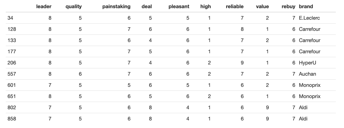
Here’s an example of what initial data looks like (on the left, the number of the row that was chosen at random):
Some interesting findings can be drawn from the very first look at data summary. For instance, note that even though all the attributes come from the scale of 1 to 10, the absolute maximum of ‘High-end’ attribute was 4. This might indicate the error in the survey, perception bias or a bad choice of keywords (where ‘High-End’, for example, is not well associated with supermarkets at all).
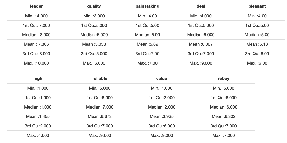
We see that it’s less than four standard deviations, on average. For a sample of this size we should expect a range of more than four standard deviations, like it is for the first two factors. This means that the distributions are platykurtic (this is a common property of survey data, due to floor and ceiling effects).
We will next examine the correlations between individual factors and their sample distributions:

It is clear from the bottom triangle that the original survey data is discrete.
The top triangle shows that several factors are quite strongly correlated. Applying the rule of 0.3/0.6, common for social studies and marketing, we interpret the correlation of ‘painstaking’ and ‘leader’, ‘pleasant’ and ‘painstaking’, ‘reliable’, ‘paintsaking and ’pleasant’, ‘high-end’ and ‘pleasant’, ‘leader’ and ‘rebuy’, and ‘value’ and ‘deal’ and ‘rebuy’ as positive and significant.
We can also talk about strong positive correlation between ‘quality’ and ‘high-end’, and ‘deal’ and ‘value’ factors.
There’s also a significant negative correlation between ‘deal’ (or ‘value’) and ‘leader’ (and ‘painstaking’ or ‘pleasant’), and, curiously, between ‘high-end’ and ‘leader. We note strong negative correlation between ’pleasant’ and ‘deal’ or ‘rebuy’, another unexpected fact.
Whereas it is easily understood that the perception of market leader implies the possibility to charge premium price and, therefore, is quite opposite to ‘best deal’ or ‘value for money’, the other two links require further studying, maybe even investigation with surveys or focus groups. In this particular case, it was established that ‘pleasant’ in customer perception refers to customer service, but its strong negative correlation with ‘price’ influences the subsequent decision to buy again (or rather, not to buy again). When applied to the supermarkets, it can be interpreted, for instance, as the fact that neat facilities, attentive cashiers and very little line in the supermarket make the customer perceive it as a ‘high-end’ store, but in this mature commodity market the customer is price-sensitive. The customers would normally return to shop for their groceries in a place where their market basket costs less, even if they have to spend time in a queue.
Furthermore, the knowledge of the market helps us to establish that there is a long-time and still ongoing price war between major supermarket chains in France, with each supermarket advertising its shopping cart as ‘the cheapest you can find’. The emphasis on ‘best quality products’, like ‘Whole Foods’ is not yet common for this market, even though a shift is seen towards this direction since 2016.
As an illustration, I include the results of the survey performed by a popular review platform Que Choisir.

It is clear that the type of the market and its understanding plays a crucial role when interpreting the results. The analyst needs to exceed caution, however, so that this knowledge doesn’t affect his or her perception and doesn’t create an interpretation bias.
The correlations between factors are easy to perceive with the plot below. Its interpretation is straightforward for the managers and doesn’t require any statistical knowledge.
The factors are re-grouped to form several clusters, and are clearly correlated within each of the blue clusters. The negative correlation is in red. The strength of the correlation is reflected both in the bubble color and size.

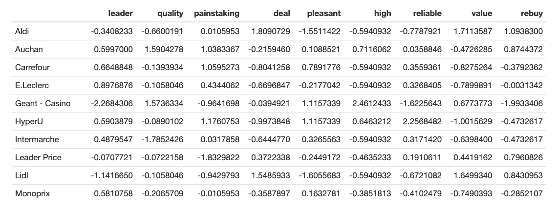
The table below shows the mean value for each brand on each of the perception factors. Note that the values are relative and are probably influenced by floor and ceiling effects, overall satisfaction halo, and, most likely, suffer from some bias (possibly, segmentation, either geographically or demographically).
It is particularly noticable with ‘Geant - Casino’ that clearly stands out for its high position as both ‘high-end’ and ‘value’ and low position as ‘leader’. We can’t have a single explanation to interpret this phenomenon, but we, for instance, suggest that the survey was performed locally, and the few (or the only) supermarket(s) of the chain give this positive perception, as well as the perception of brand underpresence. The reasonable thing for the analyst to do in this case would be to ask questions about the sample and to suggest collecting more information.
The same information could be presented in graphical form, easily perceived by stakeholders.

The next step of the analysis is finding out the number of principal components that are present in the data.

The plot above is called a scree-plot and shows the successive proportion of additional variance that each component adds. Put simply, after a kink on the plot, the remaining components add little value to the interpretation.
In this case, an elbow occurs at the 3rd or the 4th component, depending on interpretation, so the first two or three components explain most of the variation in the observed brand factors.
Let us plot the data in two dimensions, with first two principal components as the axes.

It is quite impressive that the survey with that many variables can be plotted and visually assessed in 2D. We see that these two components (axes) account for most of the variation in the data.
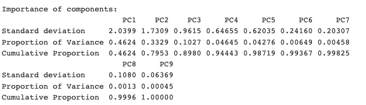
If we work with means instead of individual observations, we can obtain even more interpretable results. Below is the summary of the importance of those principal components, for perception mean by factor, by brand. While it tells a lot to a Data Scientist, the important thing for the manager to grasp is that nearly 80% of the variance in the data is captured by the first two components (as reflected in Cumulative Proportion for PC2).
The visualization of this principal components summary is the biplot below:

We see that even if the aggregated biplot is turned in the opposite direction, it is consistent with the biplot above, produced from the full set of observations. The grouping is the same and the brands are positioned roughly at the same positions in relation to the arrows.
Before we talk about positioning, let us first recall what it strictly means. Positioning is an act of desigining the company’s offering and image to occupy a distinctive place in the minds of the target market. The result of the positioning is the creation of the customer-focused value proposition.
With this in mind, the plot can be interpreted as follows: the brand “Monoprix” for example, is not very well-differentiated on any of the dimensions (is located in the middle, which is especially visible on the plot with all observations and ellipses.)
This positioning can be good or bad, depending on strategic goals of the company. It is certainly good if the company wants to appeal to many customers (as is common for a supermarket), trying to capture and keep market share through this indifferentiated offering.
It can be a good strategy for mass-targeting, in order to achieve the economies of scale in terms of targeting and promotion. We can go even further and assume that the brand has obtained the points-of-parity, while not creating the points-of-difference.
We could have suggested that in this mature commodity market, the brand is trying to compete based on lowering its production costs and by undercutting its competitors in terms of price. We see, however, that “Monoprix” is located far from ‘best value’ and ‘good deal’ leaders. In fact (and this is the fact that was not captured in the survey), the brand positions its stores in the city centers, and is benefitting from its proximity to the customer - as opposed to hypermarkets in the suburbs. I use this example to emphasize the caution with which the results must be interpreted. One should never forget that we only captured this many aspects in the survey.
Obviously, on the other hand, the absence of a strong, differentiated perception is a weakness, and especially so for the saturated market with little or no innovation. So, if the marketing manager’s objective is repositioning their brand, there are two different approaches, each of which can be chosen, based on strategic goals. We might want to increase the differentiation by following another brand (a chosen competitor or a market leader) closely. For instance, if “Intermarche” wants to follow the direction of “Geant - Casino”, the difference in the perception of those two is below:

“Intermarche” is stronger on ‘leader’, ‘reliable’ and ‘rebuy’ perception ratings. “Geant - Casino” is stronger on ‘quality’ (and 'high-end') and ‘value’ ratings.
Another option that a marketing manager might consider would be not to follow another brand, but to aim for differentiated space where no brand is currently positioned. Let us, for instance, evaluate the empty space in the top right corner, between “Geant - Casino”, “Auchan” and “HyperU”.

If the goal is to target this gap, then it could be achieved by increasing greatly its emphasis on product and service quality, while reducing slightly its emphasis on ‘leader’ in the sense of charging premium.
Cautions while using PCA for Brand Positioning
PCA method is quite common, but relatively complex. Its complexity is not the algorithm’s complexity, but rather human factor, which makes it even more important to discuss. Below are several challenges that Data Scientist faces.
Aggregation level and type
One needs to be careful about the type and level of aggregation. We used mean here, but with categorical data we might use modal. In some other cases, while working with satisfaction in the form of ordinal data, it might be more suitable to use median.
Before going ahead with interpretation of aggregated perceptual maps, we need to make sure that the dimensions of the full and aggregated data are similar, as we did above.
Data integrity and relativity
The customer needs to be warned that interpreting mean brand positioning is a tricky business. The results that are produced apply strictly to the given brands and keywords (or, in some other cases, strictly to the product category, brand and keywords). With different brands or in a different product category, the same adjectives can have a completely different relationship. For instance, Panasonic might be seen as a ‘leader’ in the survey about wide-screen television sets, but not that much in printers product category.
This also explains while introduction of the new brand (or simply the data related to this new brand, not necessarily the actual entry of the new market player) might have a great impact on the resulting perceptual map. What happens if we add “HP” data to the dataset containing “Lexmark”, “Canon”, “Xerox” and “Brother”? Only data can tell.
Assessing all factors
It’s important to verify that all of the key perceptions (keywords) have been assessed, by running the PCA on sub-samples of the data (i.e. 80%) and dropping one perception every time. The similiarity of these new outputs will improve our confidence in the PCA stability.
Interpreting perceptual map results
Finally, it’s important to avoid a misinterpretation of the map. Decision-makers need to be warned that the strength of the brand on any of the single perceptions cannot be read from the map. It’s the map of similiaritites, not the quantitative representation of descriptions.
Since PCA focuses on the first few dimensions fo the data, we are examining the major similiarities. They can obscure smaller differences between brands that are not reflected in these first important dimensions. Also, let’s not forget that other dimensions might exist that are not captured in the dataset at all!
The keywords on the plot are relative, and a caution should be taken when they are read directly from a biplot. For instance, one might say: ‘Brand Alpha is relatively differentiated by perceptions of weakness on this attribute, when compared to its relative position on other attributes.’
Perceptual maps are most useful when forming hypothesis and pointing out at further analysis of brand and product positioning which must be done. They should not be treated as absolute assessments of position, but as a basis of discussion about position and potential repositioning strategies.
3 Comments
How do you make sure though that you interpret correctly the position of the points that are far from every vector? Like this Casino brand, it looks obviously good on 'quality', but what about other dimensions?
It's not straightforward sometimes, so if in doubt, I look at the PCA table as well. Numbers are easier for our eyes than nine dimensions fit in two.
What's your reference for price wars and what did you use for the study of this market, in general?
Multiple sources, mostly internet search. This article is great (in French though). https://www.cairn.info/revue-vingtieme-siecle-revue-d-histoire-2006-3-page-57.htm